
T'time
A conceptual wellness brand built around tea — selling organic teas and providing a mindful tea drinking experience through a companion mobile app.
Summary
T'time is a conceptual wellness brand and mobile app designed around mindful tea drinking. Created as my Master's thesis project, it brings together brand identity, packaging, and app design into one calm, cohesive experience.
I led the full project from research and strategy to final visuals, including:
- Brand strategy and visual identity.
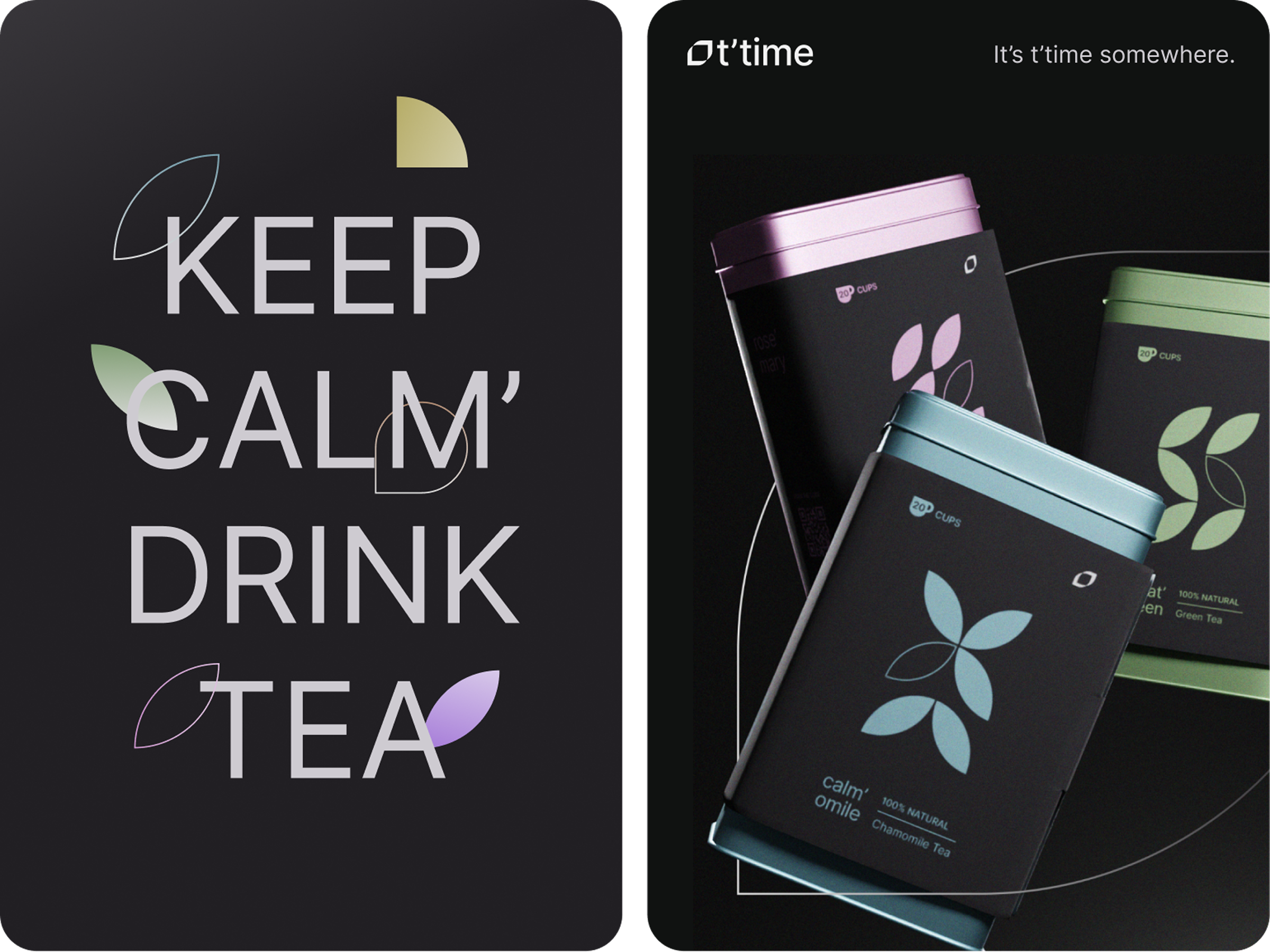
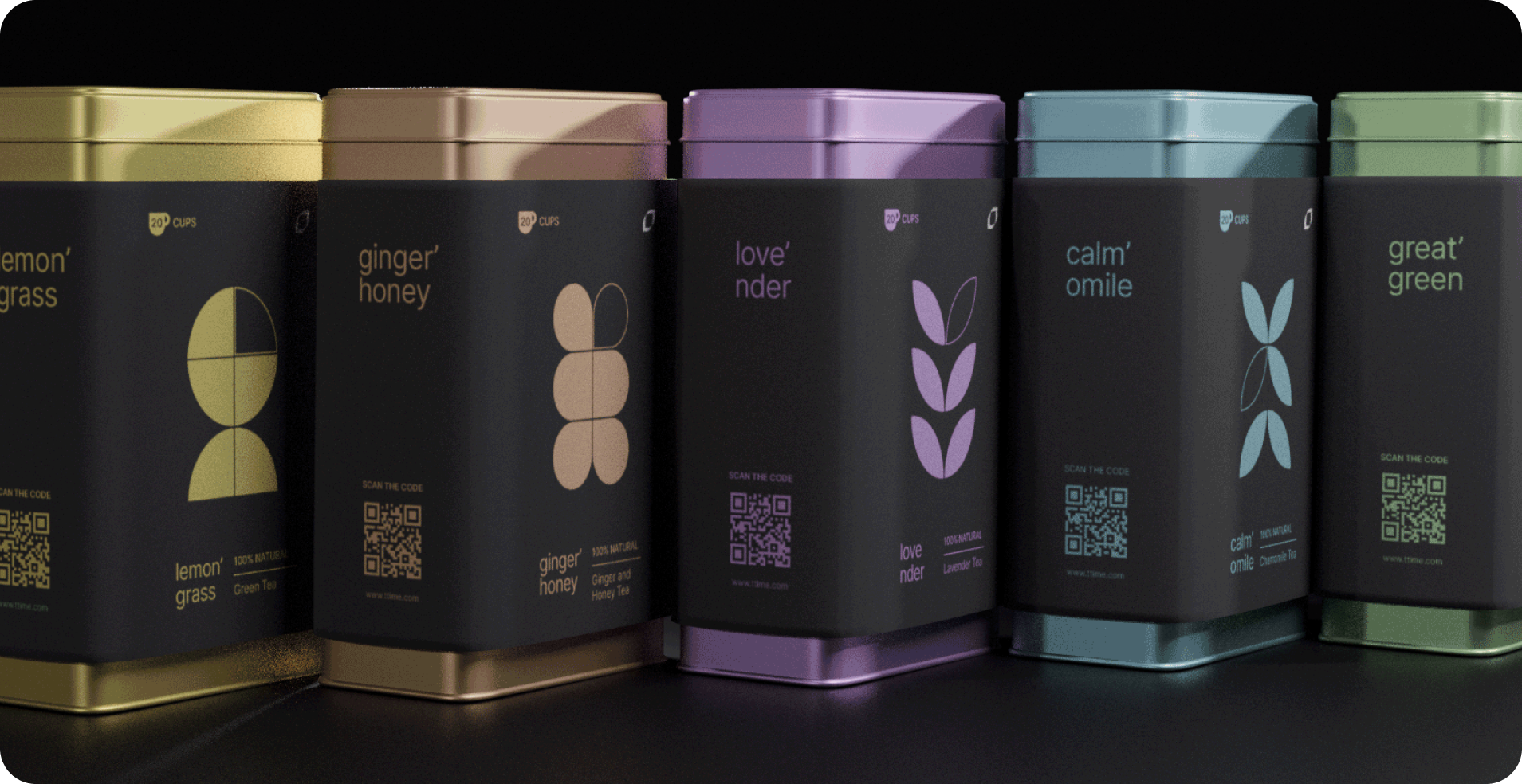
- Tea packaging with colour-coded variants and QR-linked meditations.
- UX research, personas, and information architecture.
- Wireframes and navigation iterations for a low-friction app experience.
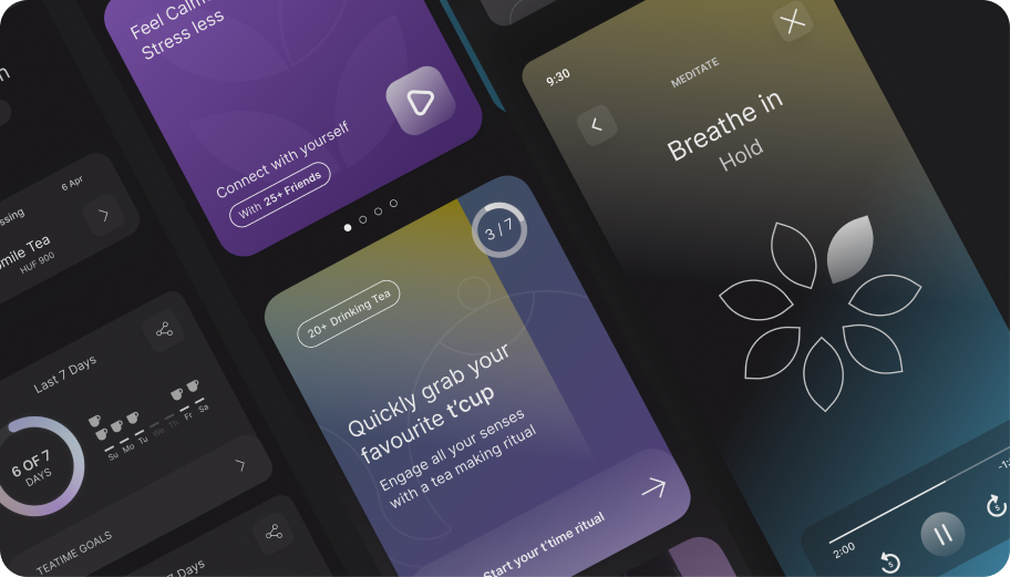
- Final UI design for guided meditations, tea rituals, and the tea shop.
- A cohesive brand, packaging, and product experience that earned a distinction grade.
Problem
Unmet audience need
The target audience — Millennials and Gen-Z — are the largest demographic of tea drinkers, but no brand was effectively merging the ritual of tea with modern wellness and mindfulness.
Cross-medium coherence
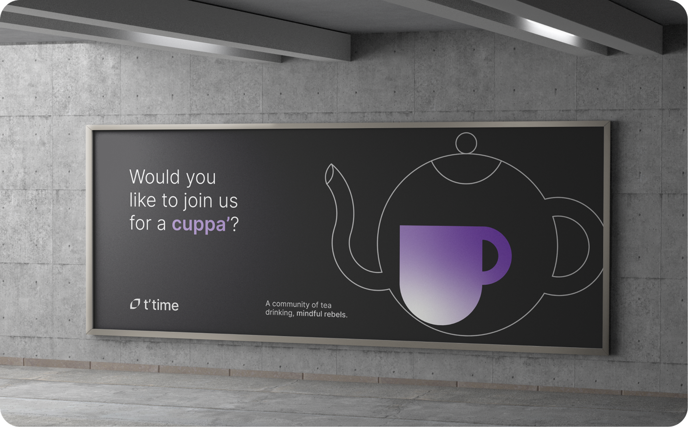
The brand identity needed to live coherently across logo, physical tin packaging, advertising collateral, and a mobile app UI.
Zero-friction UX
The app needed to reduce friction to near zero: users dealing with stress or anxiety don't have patience for complicated onboarding or navigation.
Solution
Full brand identity
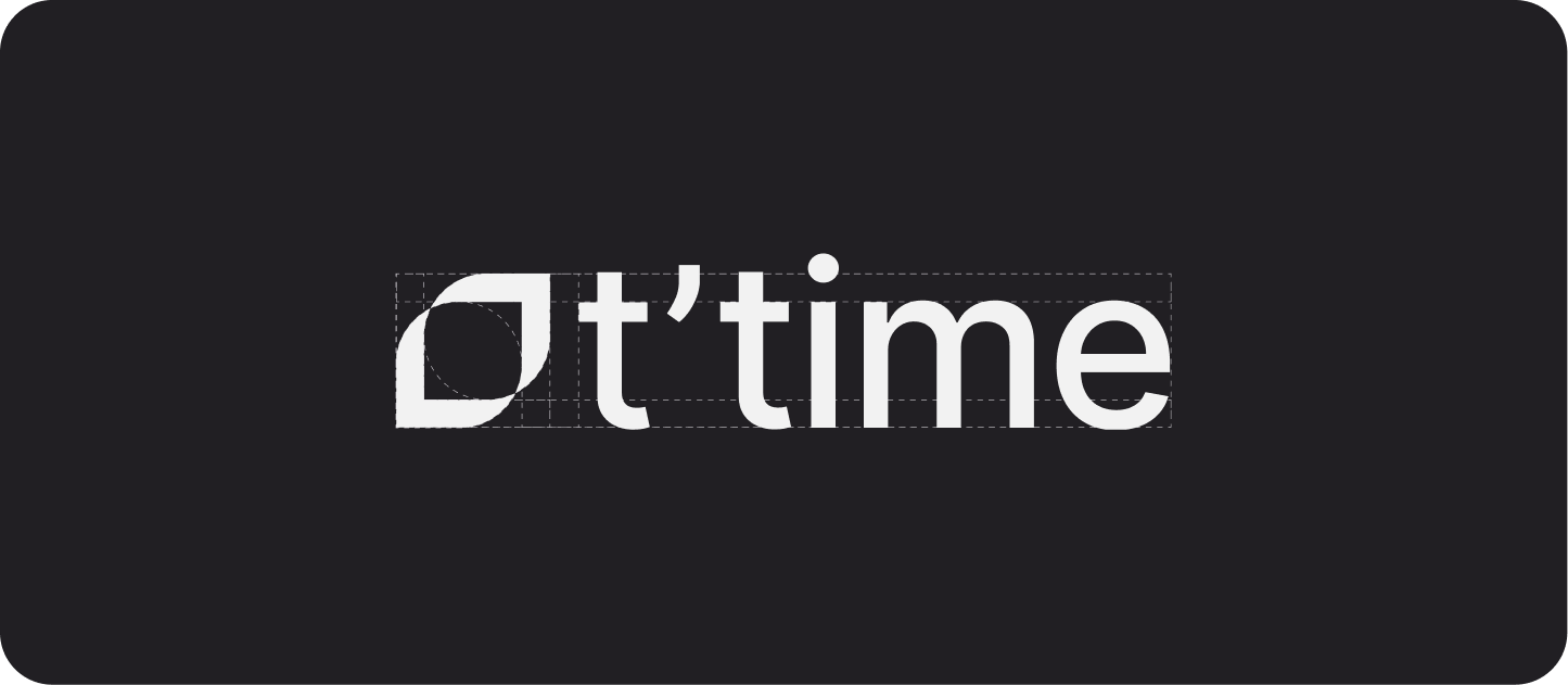
Wordmark, icon, colour palette, typography, and photography direction — all built around a dark, premium, botanical aesthetic.
Physical tin packaging
Colour-coded variants per tea blend, with QR codes that link directly to the corresponding in-app meditation.
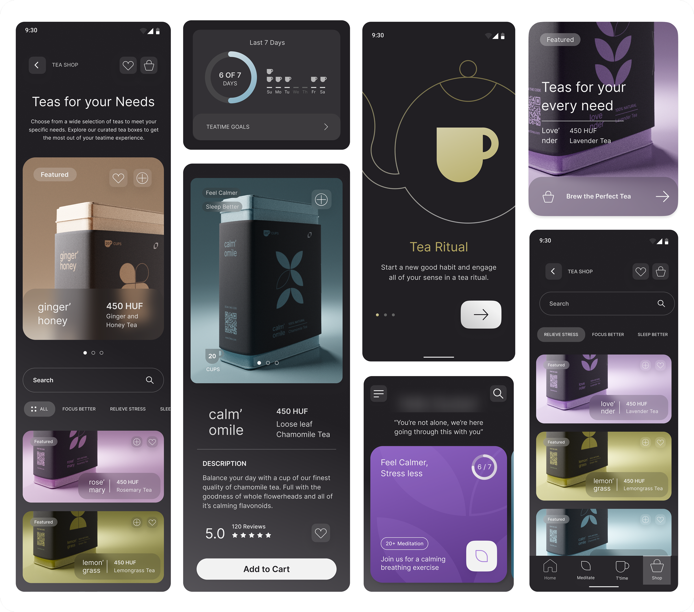
Mobile app with 3 core features
Guided meditations (adjustable duration), tea rituals (under 5 minutes), and a tea shop.
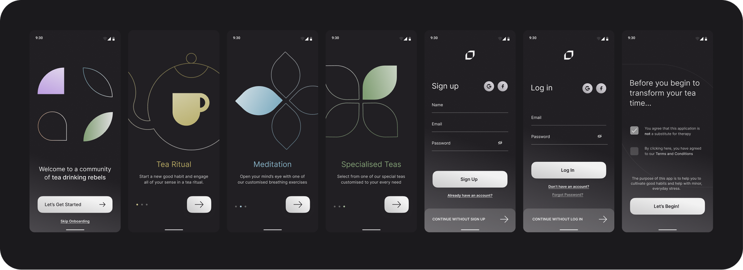
Calming onboarding experience
With the option to skip sign-in entirely.
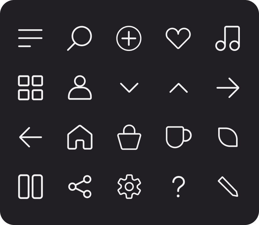
Custom icon set
Designed to support the app UI.
Process
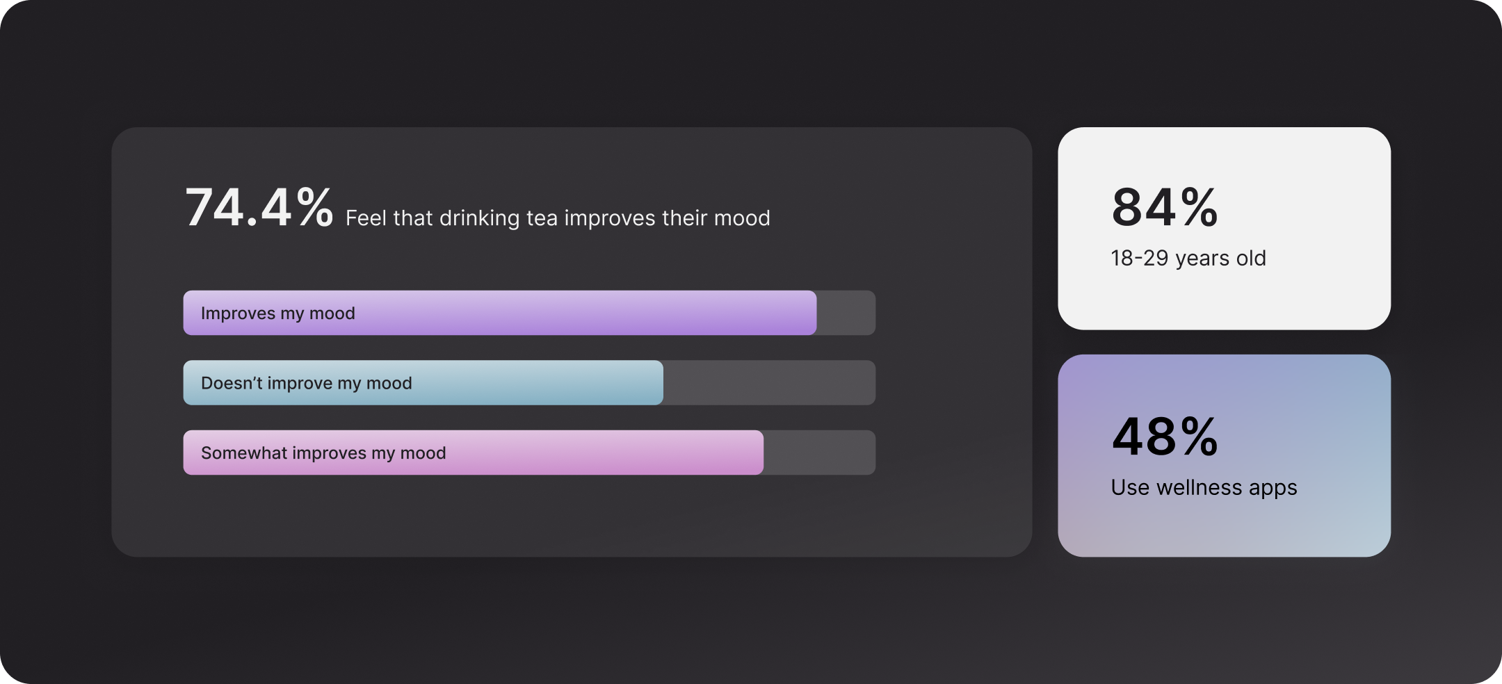
- Conducted a survey targeting 18–29 year old tea drinkers. 74.4% reported that drinking tea improves their mood; 43.6% said tea was part of their daily routine.
- Applied the Golden Circle framework to define the brand's Why, How, and What.
- Mapped the brand's competitive position against wellness, meditation, and lifestyle apps.
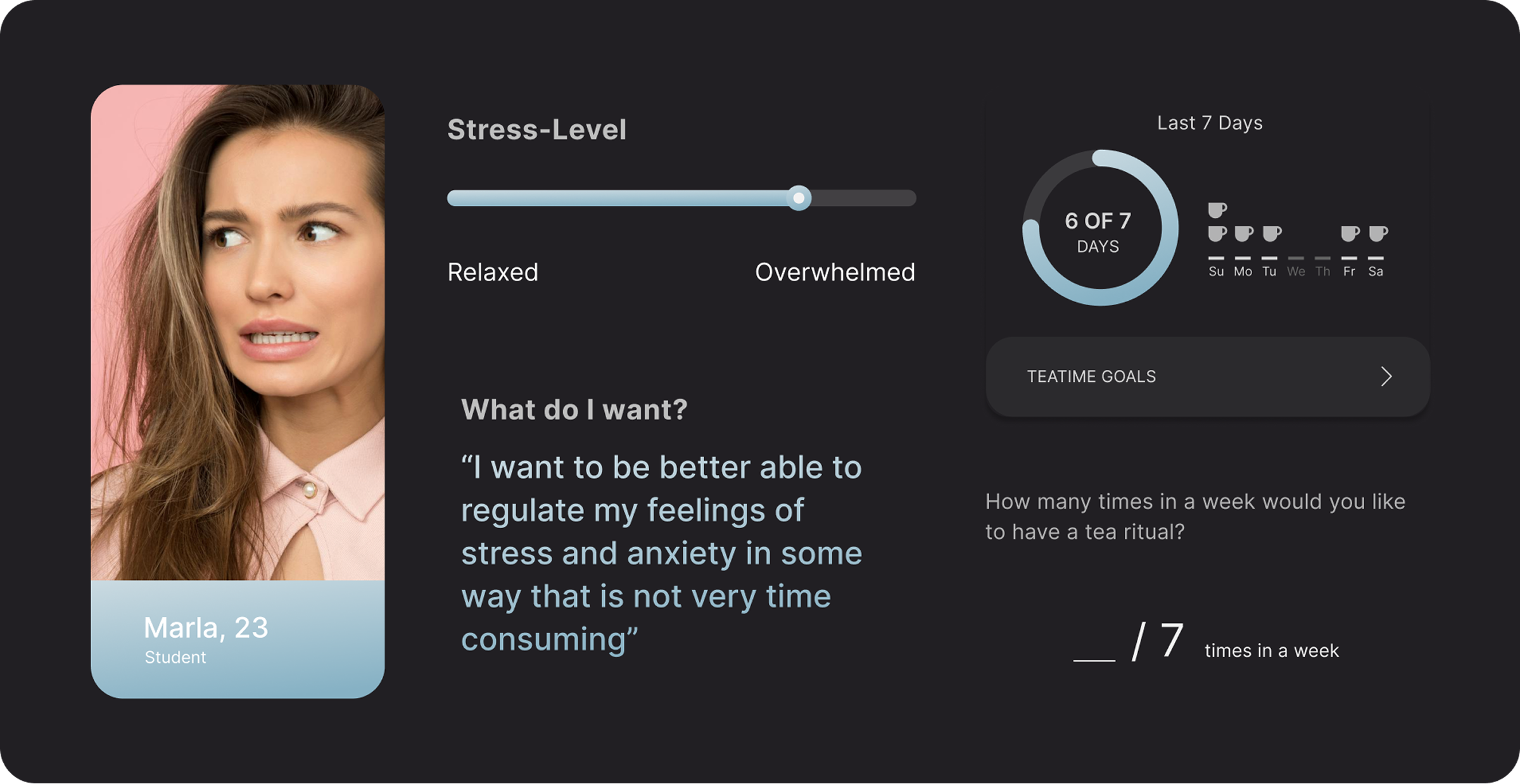
- Created user personas (Marla, 23 — stressed student; John, 26 — distracted marketing manager) revealing a consistent need: fast, non-intrusive stress relief.
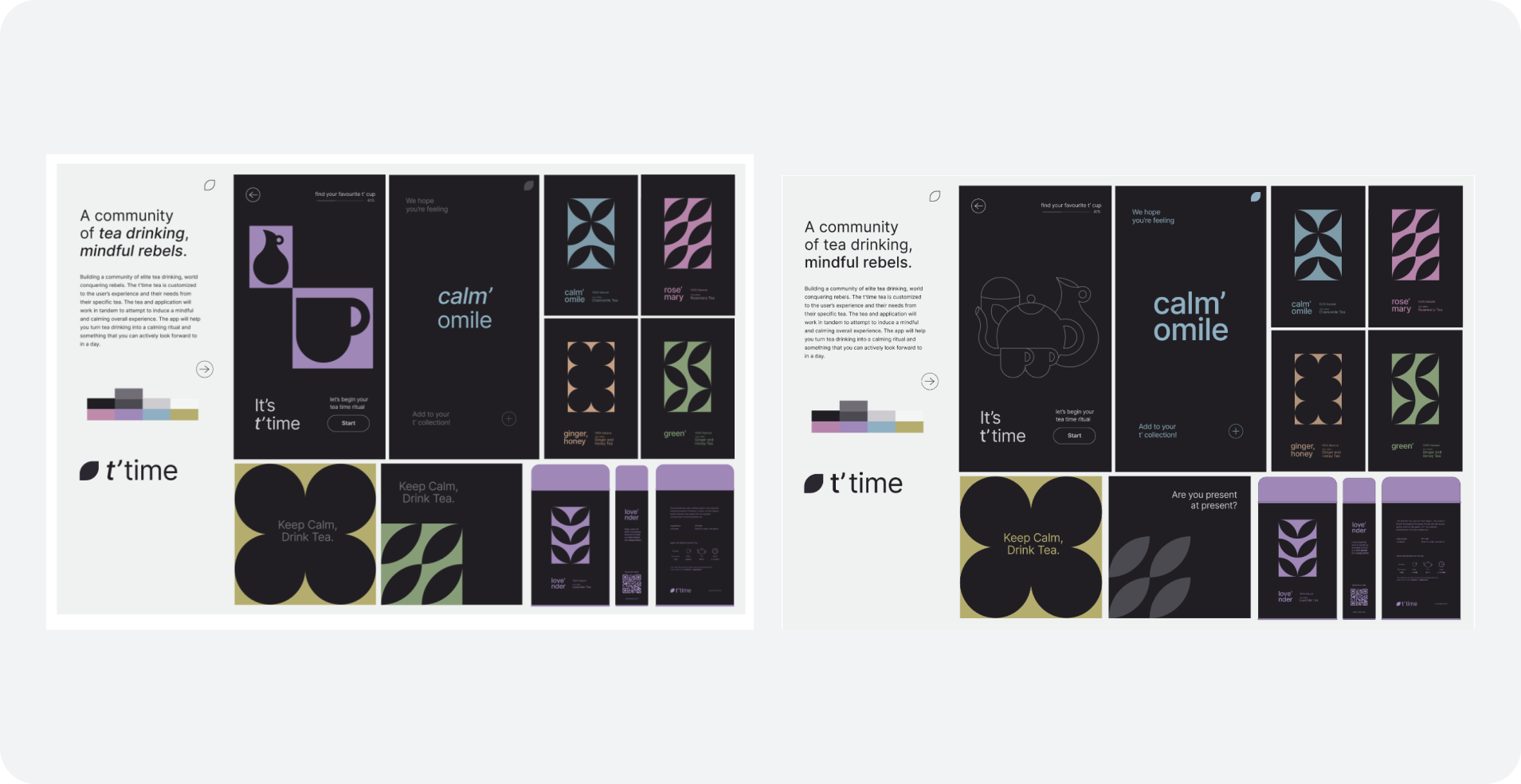
- Built multiple stylescapes and iterated until a dark, cool-calm aesthetic with botanical iconography was chosen.
- Designed information architecture with 2 entry points (QR code on packaging, downloaded app) and 3 core sections (Meditate, T'time ritual, Shop).
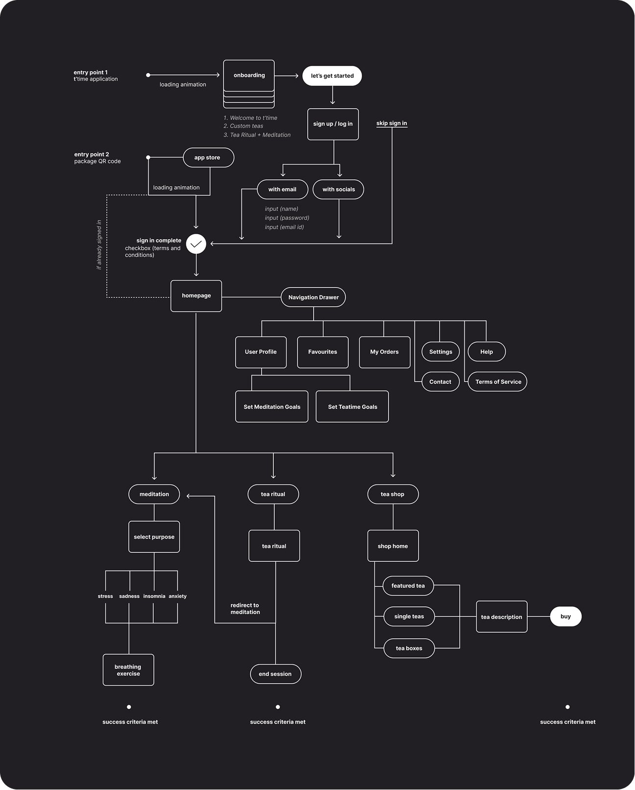
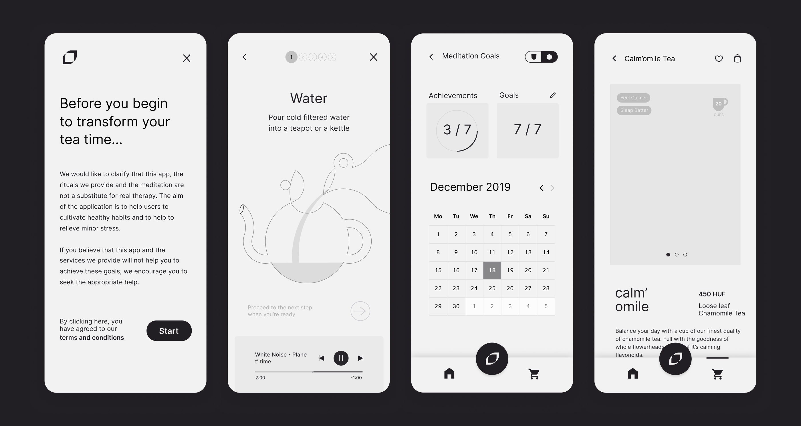
- Wireframed all screens on the basis of 3 main userflows. Meditation, shopping and tea rituals.
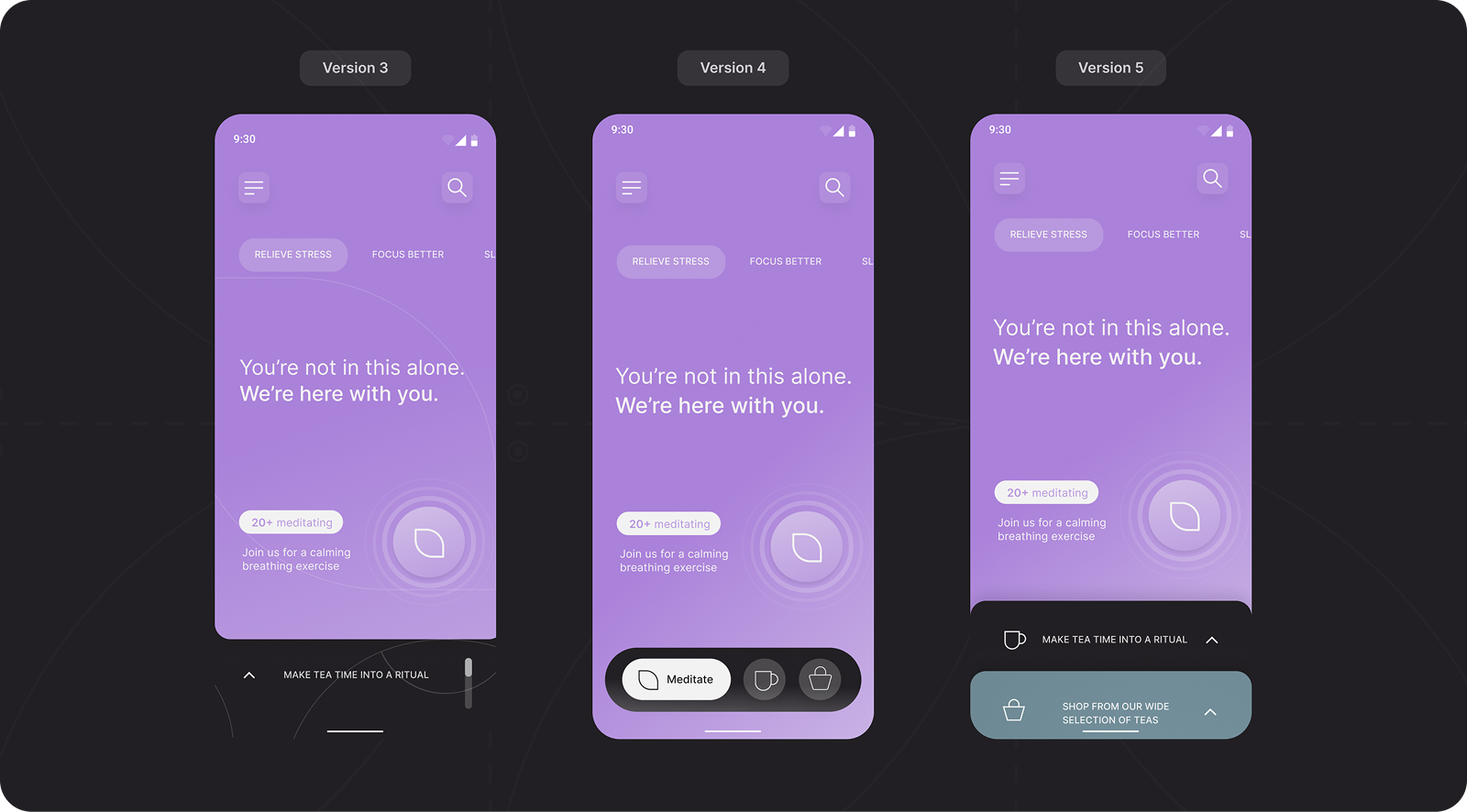
- Iterated to find the quickest and easiest navigation system, in the end, we settled for the most fail safe solution.
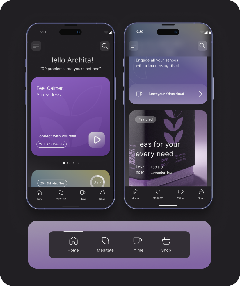
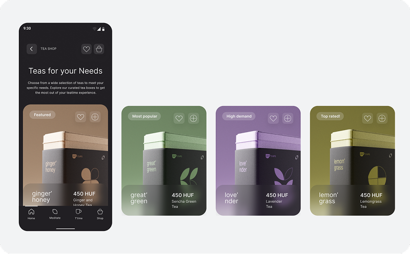
- Designed the final UI across all app screens and states.
Outcome
Graduated with distinction for my Masters in Graphic Design at Budapest Metropolitan University
- The project was recognised for its cohesion across brand, packaging, and product design — demonstrating end-to-end design thinking from research through to production-ready UI.